DISCOVER PROJECT
Pano
AI-Driven Social Place Discovery Platform
Itinerary Planning & Mapping Experience Design
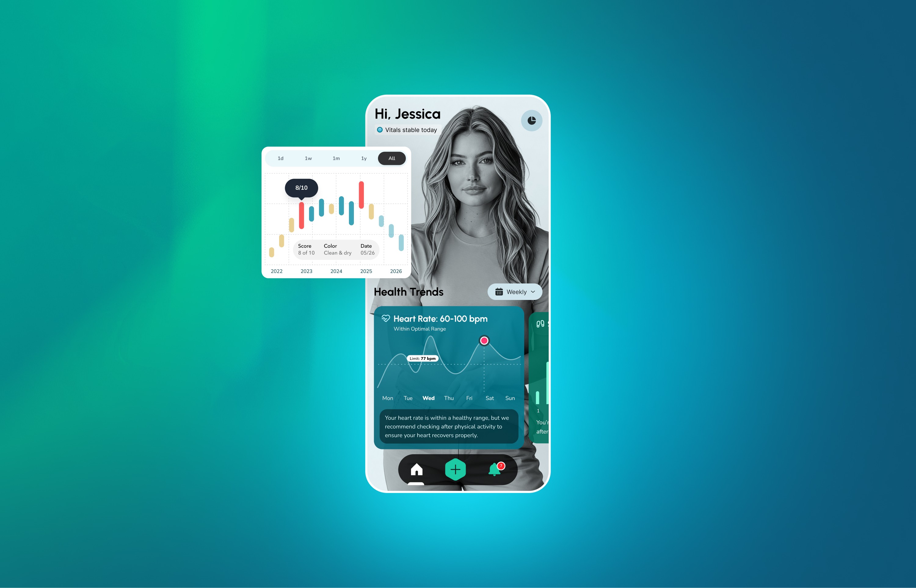
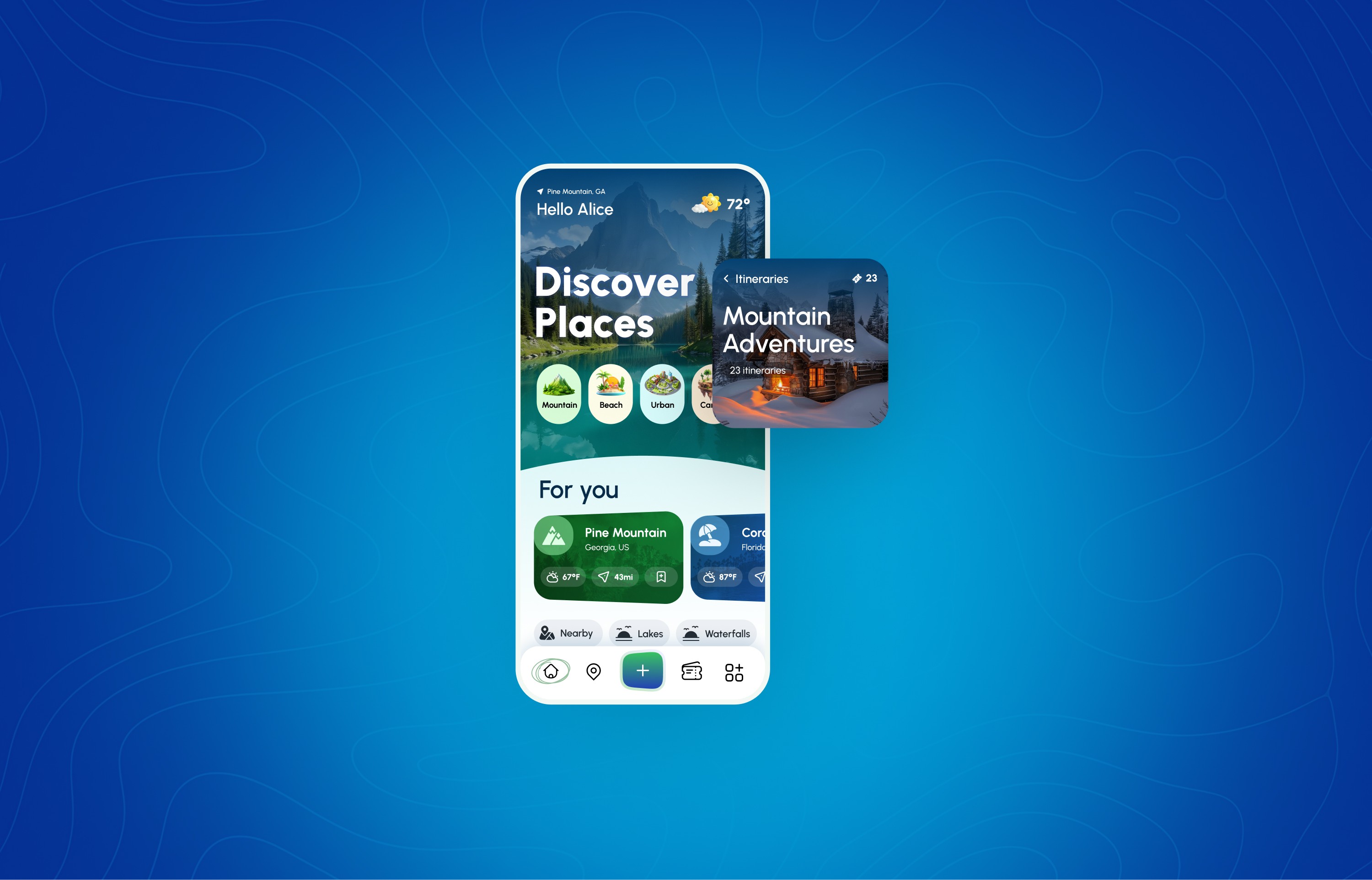
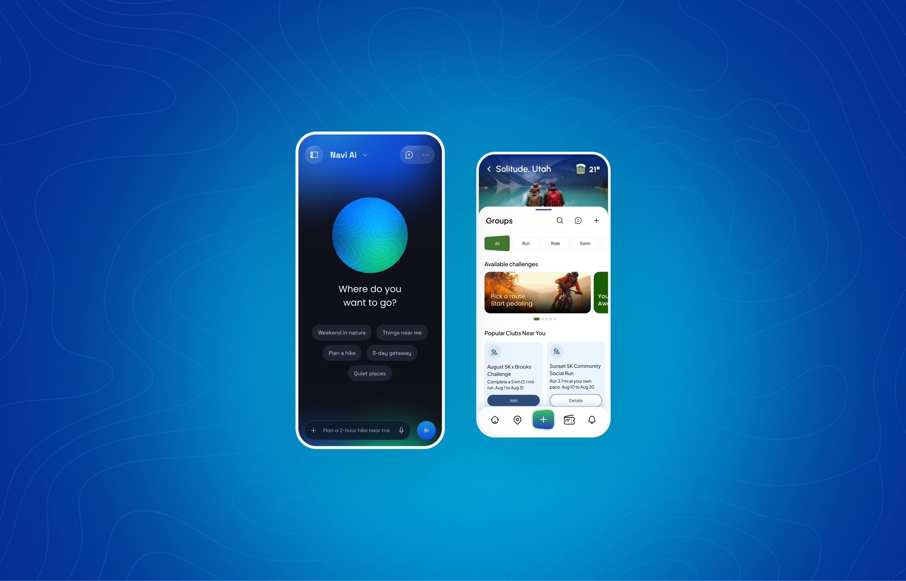
Pano is an AI-driven social place discovery and itinerary planning platform that helps people plan experiences around their time, interests, and location. I led product and UX design from the ground up, shaping the core discovery, map, itinerary, and activity-tracking experiences.
Through qualitative research, I translated real planning behaviors into an AI-first UX strategy. I designed core wireframes, partnered closely with product and engineering, and helped define Pano’s AI direction around natural language planning, explainable recommendations, and scalable personalization.
key
responsibilities
UX Strategy / UX Audit / Research / UX Design / UI Design / Usability Testing

Project Overview
Pano is an AI-driven social place discovery and itinerary planning platform designed to help people move from inspiration to action with less effort. The project focused on defining a clear UX foundation across discovery, maps, itineraries, and AI-driven planning, simplifying how people decide where to go and what to do. The work established scalable interaction patterns and guardrails to support social signals, time-aware planning, and future personalization.
Challenge / Solution

Solution
The solution was a user-centered design of Pano’s core discovery, map, and itinerary experiences, shaped by real planning behaviors and social use cases. We simplified exploration into clear, time-aware steps, unified maps, places, and itineraries, and built a scalable Figma design system to support rapid iteration. This gave Pano a clearer product narrative, a calmer planning experience, and a strong foundation for scaling social engagement and AI-driven personalization.
UX Strategy Roadmap
This UX strategy roadmap shows how I guided Pano from early insight to a scalable product foundation while maintaining alignment across design, product, and engineering. It begins with research, combining qualitative interviews, competitive audits, and stakeholder input to uncover where people struggle with discovery, decision-making, and planning across existing platforms.
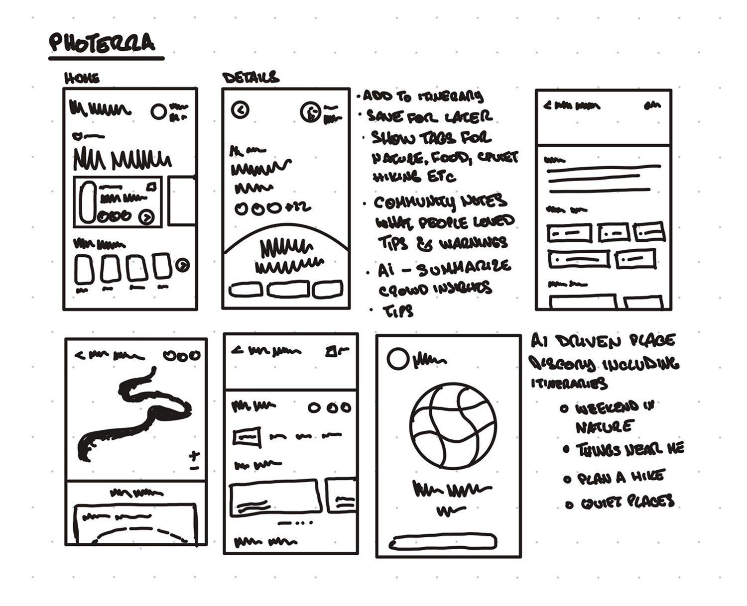
From there, the work moves into UX design, where I defined the information architecture, mapped key flows across maps and itineraries, and validated core paths through low- and mid-fidelity wireframes before investing in polish. Once the structure was solid, I guided UI exploration and prototyping to support clarity, consistency, and future growth. Implementation focused on clear handoff, QA, and AI guardrails to ensure recommendations were explainable and user-controlled. Ongoing feedback and usage signals then informed the next iteration cycle, helping refine discovery, planning efficiency, and personalization over time.

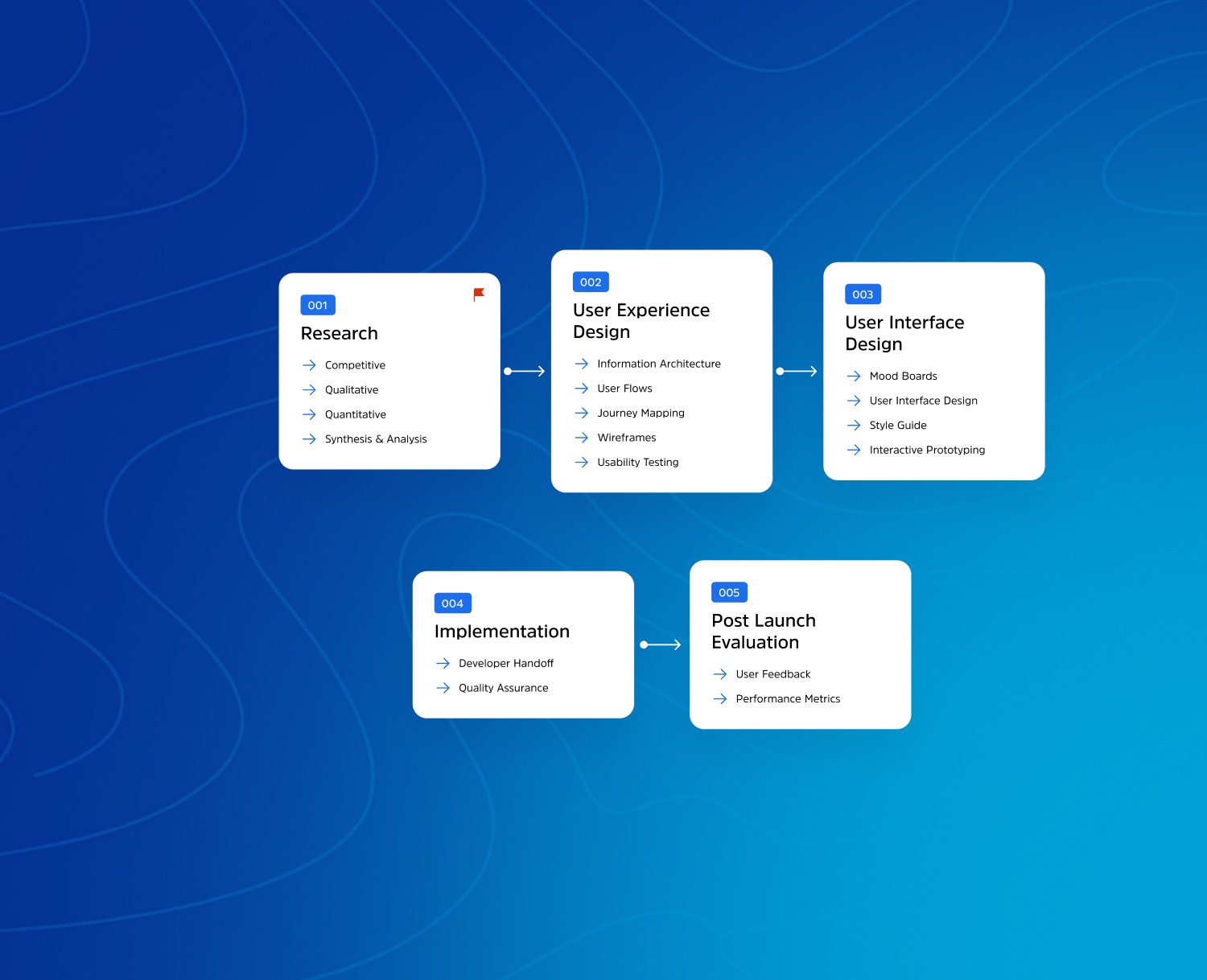
Design philosophy: simplify complex discovery and planning into clear, trustworthy experiences that scale.
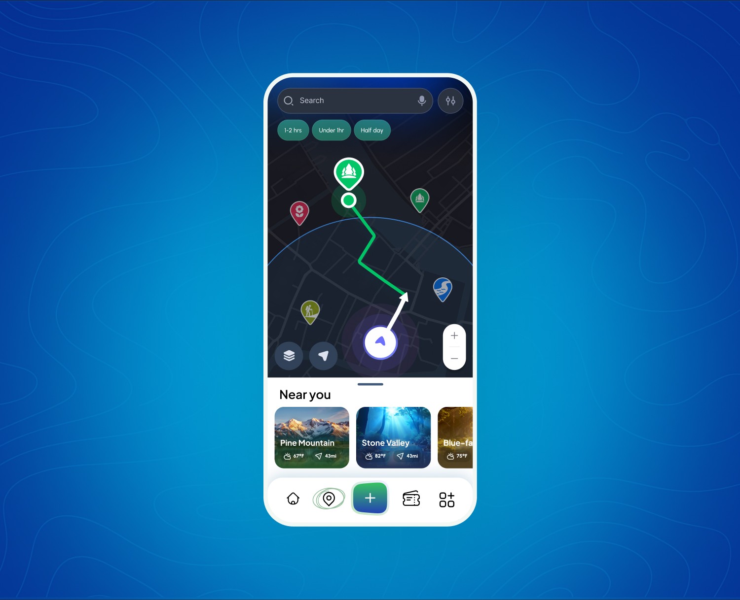
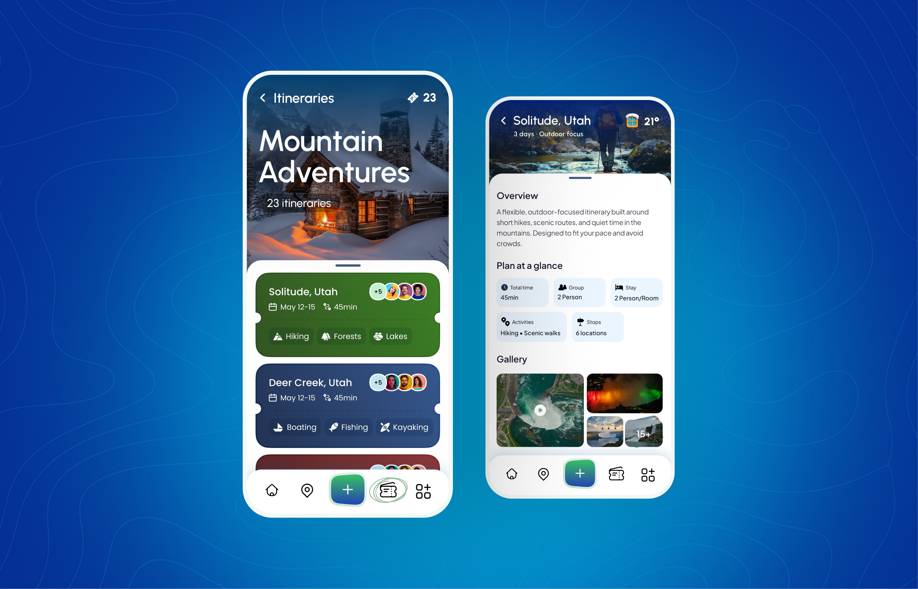
User Interface Design
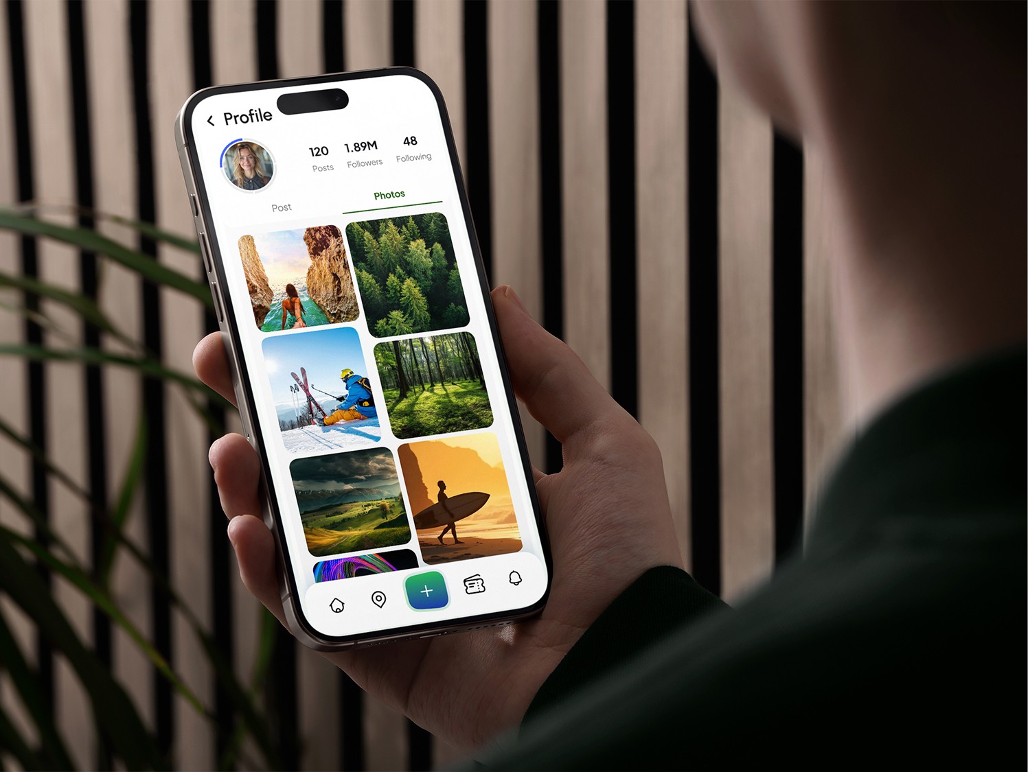
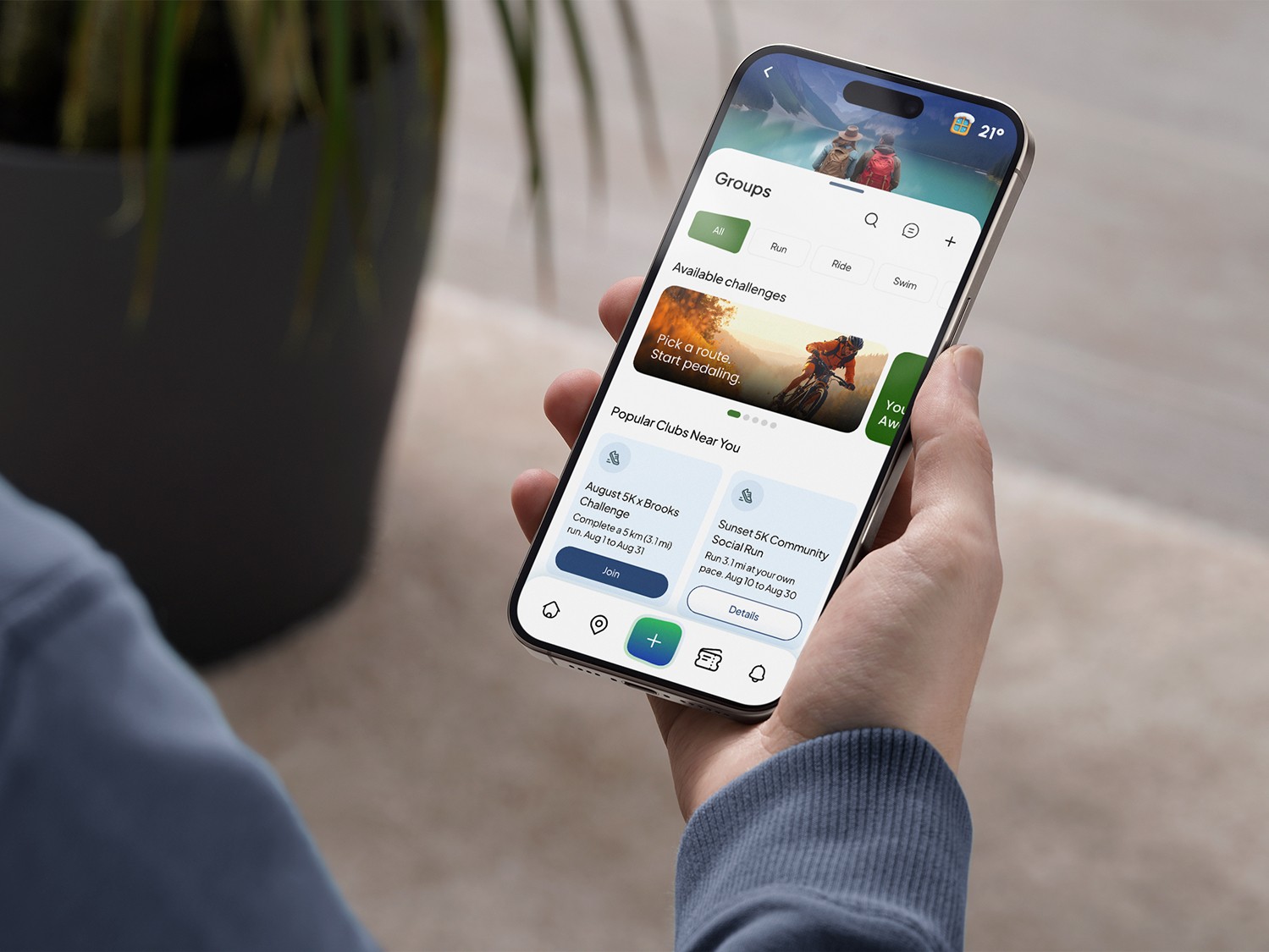
The finalized Pano experience brings discovery, maps, and itineraries together into a clear, connected flow. It helps people move from inspiration to action by making recommendations understandable and plans easy to follow.
By pairing clear guidance with explainable recommendations, we increased confidence in planning decisions and created a stronger foundation for personalized discovery.
PLATFORM IMPACT METRICS
Early results and directional signals from Pano’s design and product validation work, showing improvements in discovery clarity, planning efficiency, and confidence in recommendations. Metrics reflect early validation, usability testing, and prototype engagement patterns used to guide product direction and prioritize feature development.
Discovery-to-plan conversion
Planning speed
Recommendation trust signals
Fragmented planning behavior
Testimonials
These testimonials reflect feedback from early research participants, internal stakeholders, and concept reviews. They reinforce how Pano’s approach to discovery, planning, and AI-driven guidance improves clarity, confidence, and decision-making.
“Planning finally feels manageable. I don’t get stuck comparing places. I can actually decide and go.”
⸺ Research Participant
“I like knowing why something is suggested. It makes the recommendations feel useful instead of random.”
⸺ Beta User
“Planning finally feels manageable. I don’t get stuck comparing places. I can actually decide and go.”
⸺ Beta User
“I like knowing why something is suggested. It makes the recommendations feel useful instead of random.”
⸺ Early Tester
“The focus on time makes a big difference. It’s the first tool that respects how much time I actually have.”
⸺ Stakeholder Reviewer
“It helped me move from browsing to actually making a plan. I spent less time comparing and more time deciding.”
— Research Participant