I slashed bounce rates and boosted conversion funnels by 45% through targeted research and a strategic site revamp.
Summary
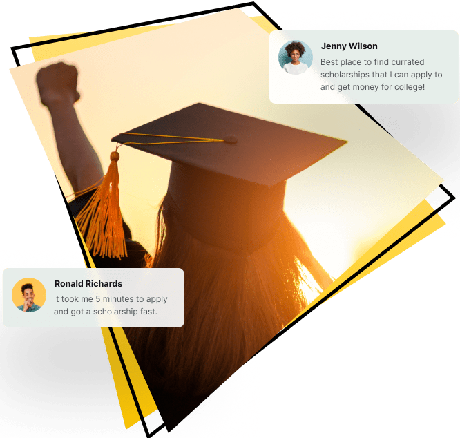
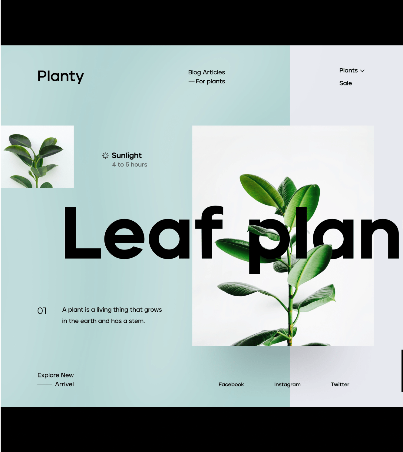
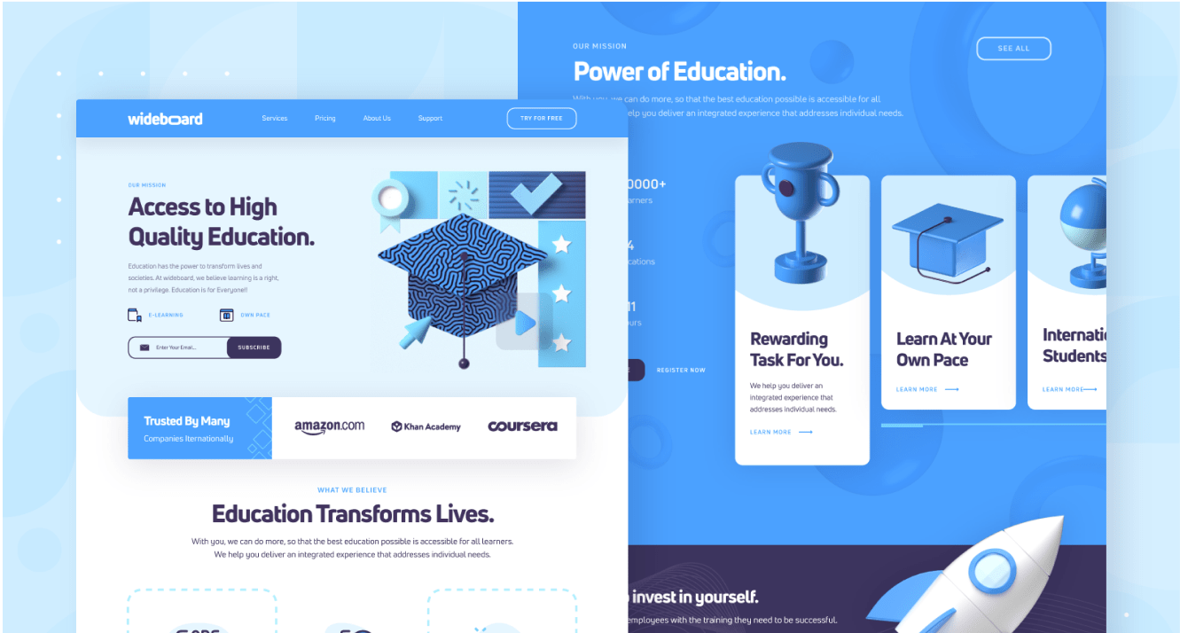
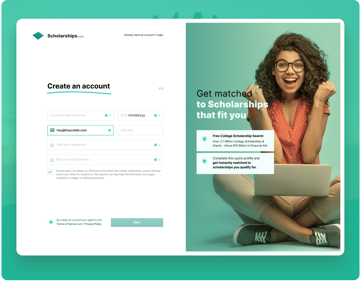
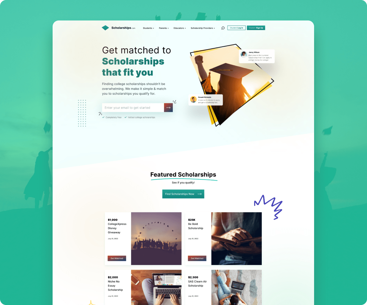
I took the helm of Scholarships.com’s revitalization project, beginning with a meticulous research phase. Through carefully designed surveys and detailed interviews, we extracted key pain points from the user experience. With this compelling data in hand, I orchestrated a complete brand transformation for Scholarships.com, introducing a sophisticated color palette, a rejuvenated logo, and refreshed imagery to align with the user’s needs and aspirations.
This not only gave Scholarships.com a fresh, competitive edge but also drove remarkable business metrics. The end result? A phenomenal 45% uptick in conversion rates and a significant drop in bounce rates, propelling Scholarships.com into direct competition with the biggest names in the scholarship research industry.
Roles
Head of Design
UX Designer
UI Designer
Researcher
Tools
Figma
Adobe CC
Miro
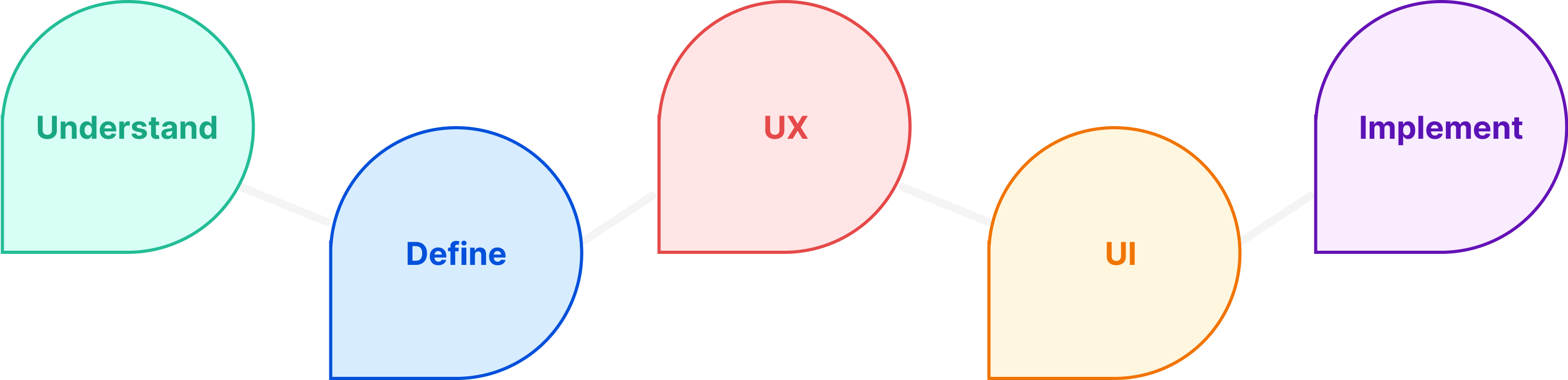
Responsibilities
Strategy
Competitive Research
Qualitative Research
User Personas
UX & Visual Design
Prototyping
Challenge
Scholarships.com faced a triad of critical challenges that threatened its long-term viability. First, a concerning pattern emerged of high student dropout rates on the site, coupled with alarmingly low conversion metrics that had been in a consistent downward spiral year over year. To compound the issue, the website was encumbered by an outdated design aesthetic rooted in the late 90s, making it increasingly irrelevant in today’s digital landscape.
Solution
To pinpoint the problems, my first step involved gathering firsthand insights from students to locate the bottlenecks affecting the user journey. Armed with concrete qualitative data, I meticulously redesigned the user experience, systematically addressing each pain point. The capstone was a sweeping overhaul of the brand and user interface, catapulting Scholarships.com to a leadership position in their market.
Process
Market Research: Qualitative
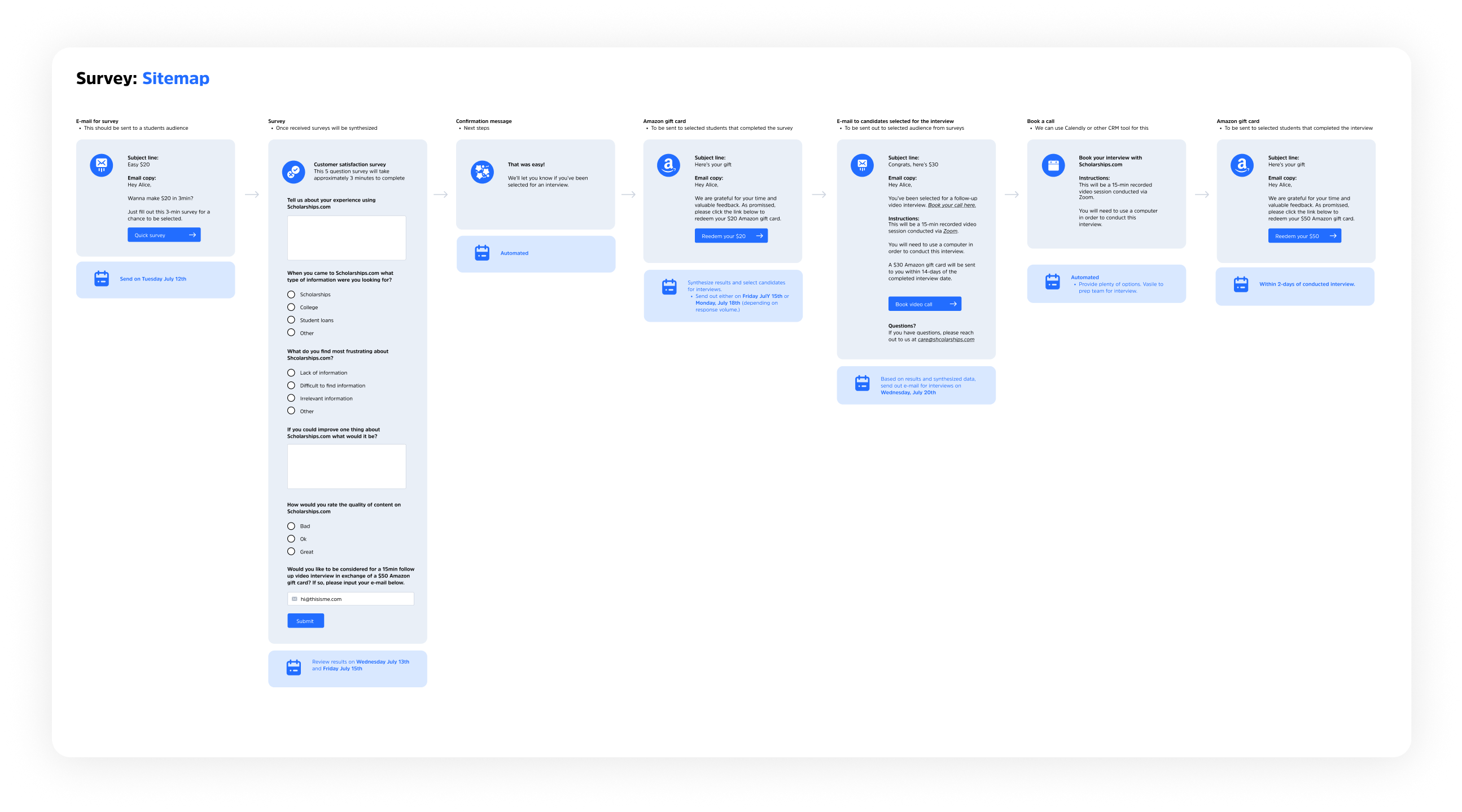
In the qualitative research phase, I designed a survey disseminated via email to engage students. Completing the survey entered participants into a $25 gift card drawing, and offered an additional $50 for a follow-up interview. This strategy efficiently pinpointed our key issues.
Surveys
I sent out surveys to 1,000 students, expecting a 20% turnout. The response was overwhelming, offering invaluable data that exposed the website’s shortcomings. Students perceived the site as a hoax and felt overwhelmed by disorganized content. They questioned its credibility, and confusing navigation funnels left them frustrated, ultimately causing them to leave the site altogether.
Interviews
Following the survey, we handpicked 30 students for in-depth interviews to further investigate the key issues. These conversations revealed crucial gaps in the user experience. For instance, the absence of advanced filtering on the scholarship search page severely impacted usability. Additionally, we found that a lack of notifications left students uninformed about new opportunities, causing them to miss out and reducing their engagement with the site.
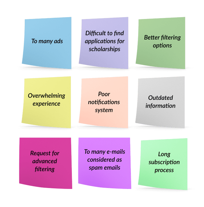
Synthesis
Data synthesis revealed key pain points among students:
Overwhelm during signup, onboarding, and scholarship discovery.
Insufficient information forcing extra work on external platforms.
Inadequate filtering and display options for relevant scholarships.
Notification shortcomings viewed as spam.
Overall outdated and subpar user experience.
Note: The issues listed are based on actual feedback from user surveys.
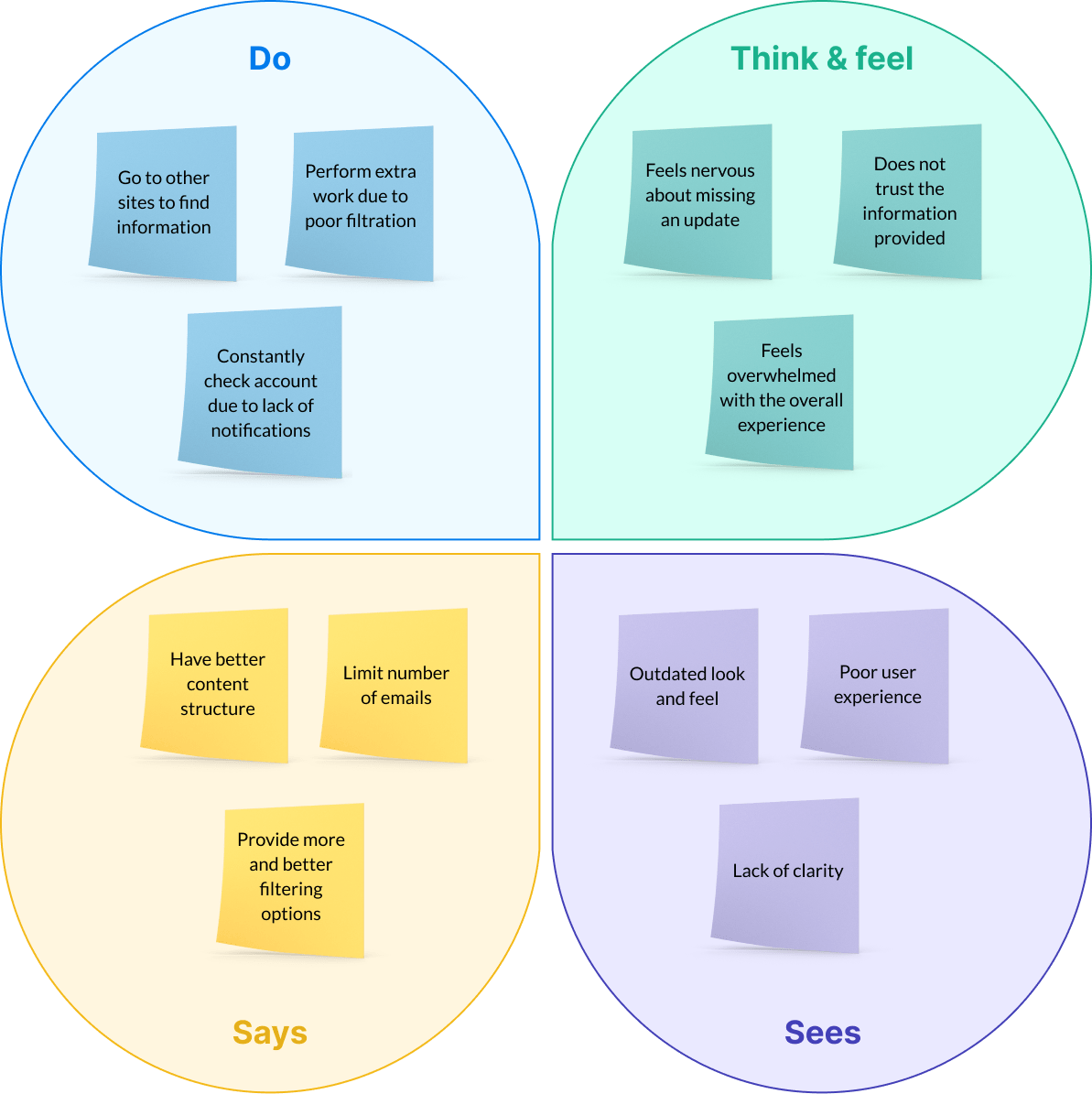
Empathy Map
Categorized user pain points gathered from interviews into four aspects:
Thoughts and feelings.
Visual observations
Verbal expressions
Actions taken.
This methodology helped in sorting each issue according to its distinct characteristic.
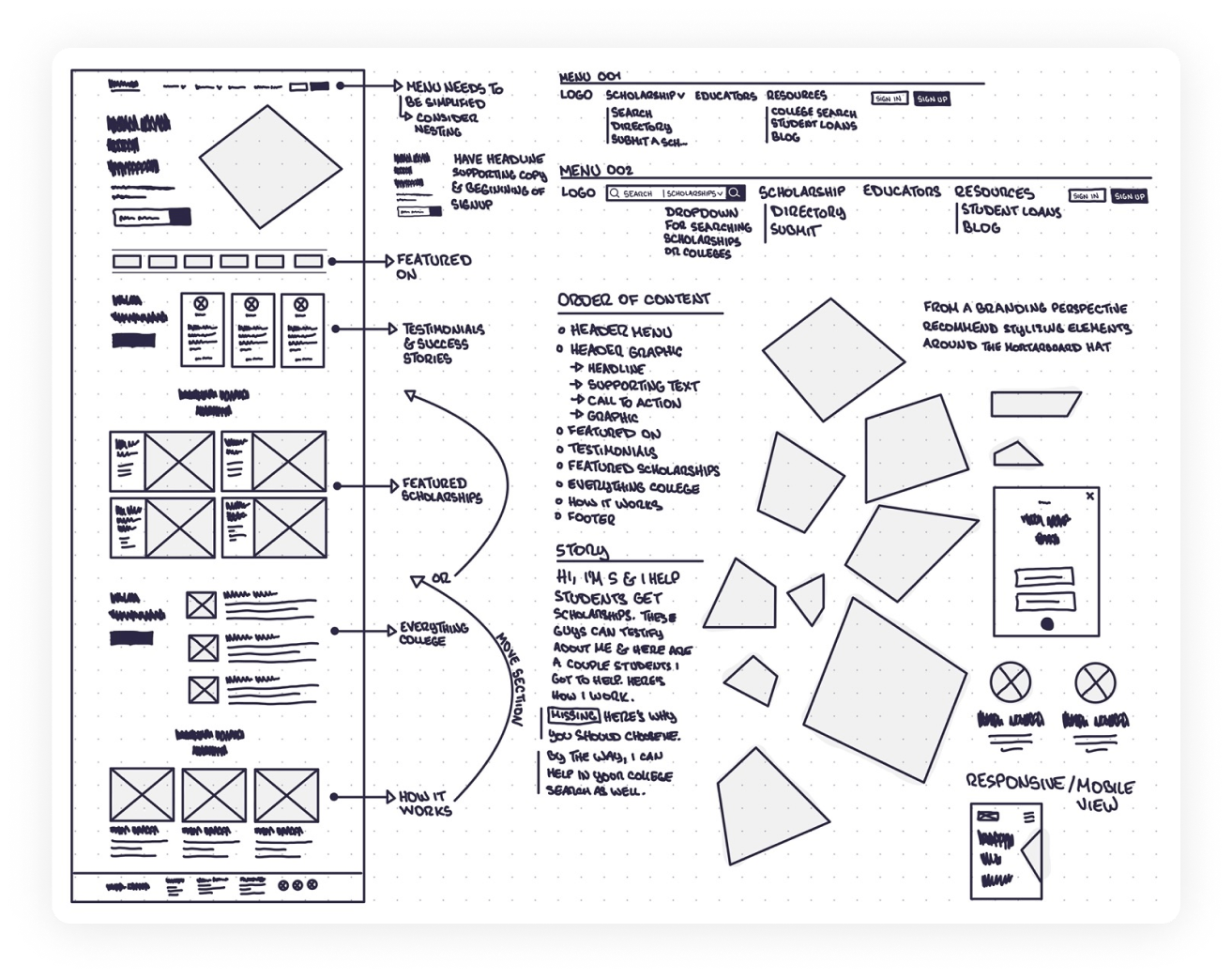
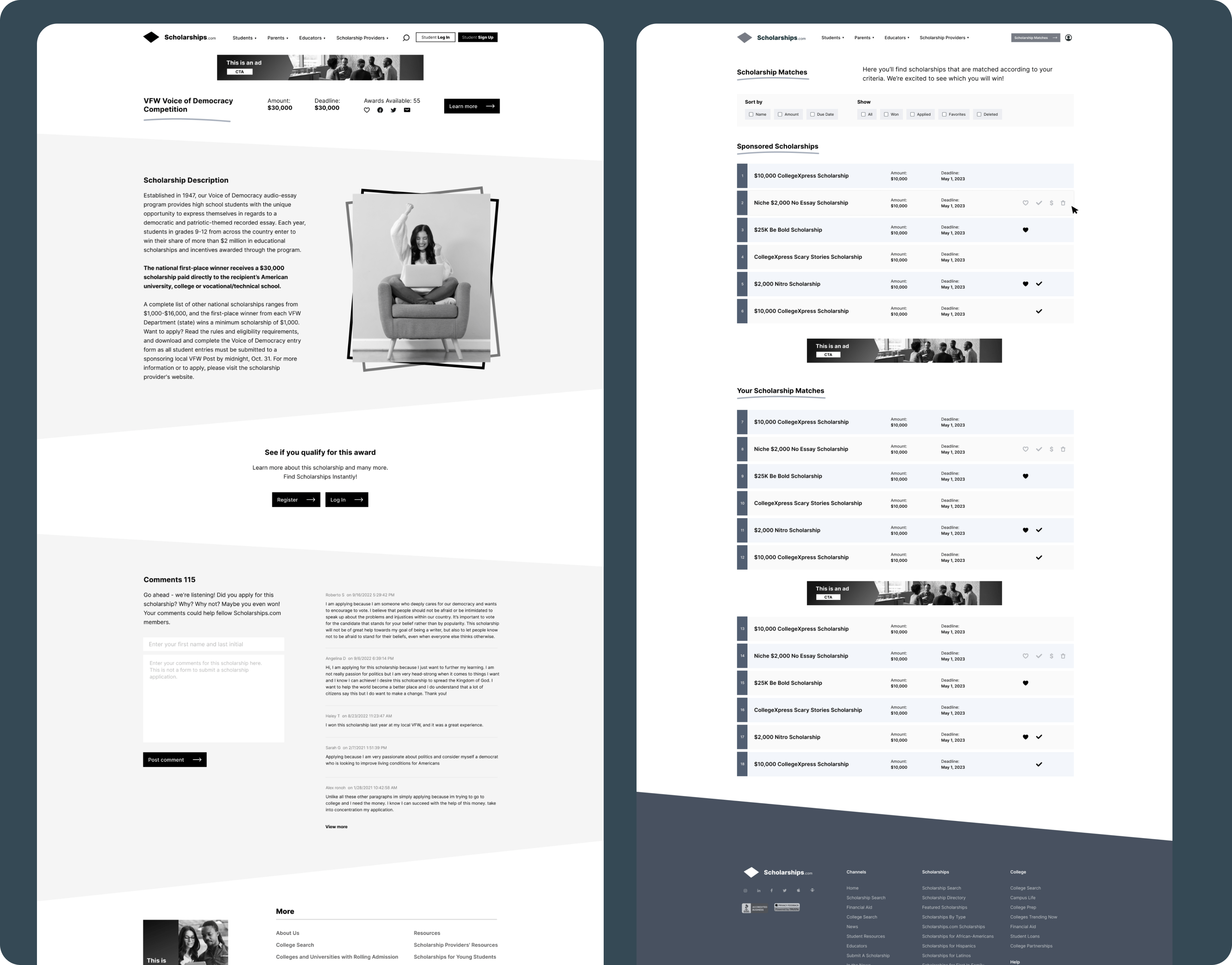
Sketches
In the early stages of the Scholarships.com project, I started with low-fidelity sketches to quickly conceptualize ideas.
At this juncture, the focus was solely on the operational framework of the product, bypassing visual elements such as color, graphics, and illustrations.
High fidelity wireframes
After polishing the initial sketches, I moved on to crafting detailed, annotated wireframes. These high-fidelity, monochrome representations provided a more nuanced look at the product.
At this point, my attention shifted to perfecting the functional blueprint and working methodology of the platform.
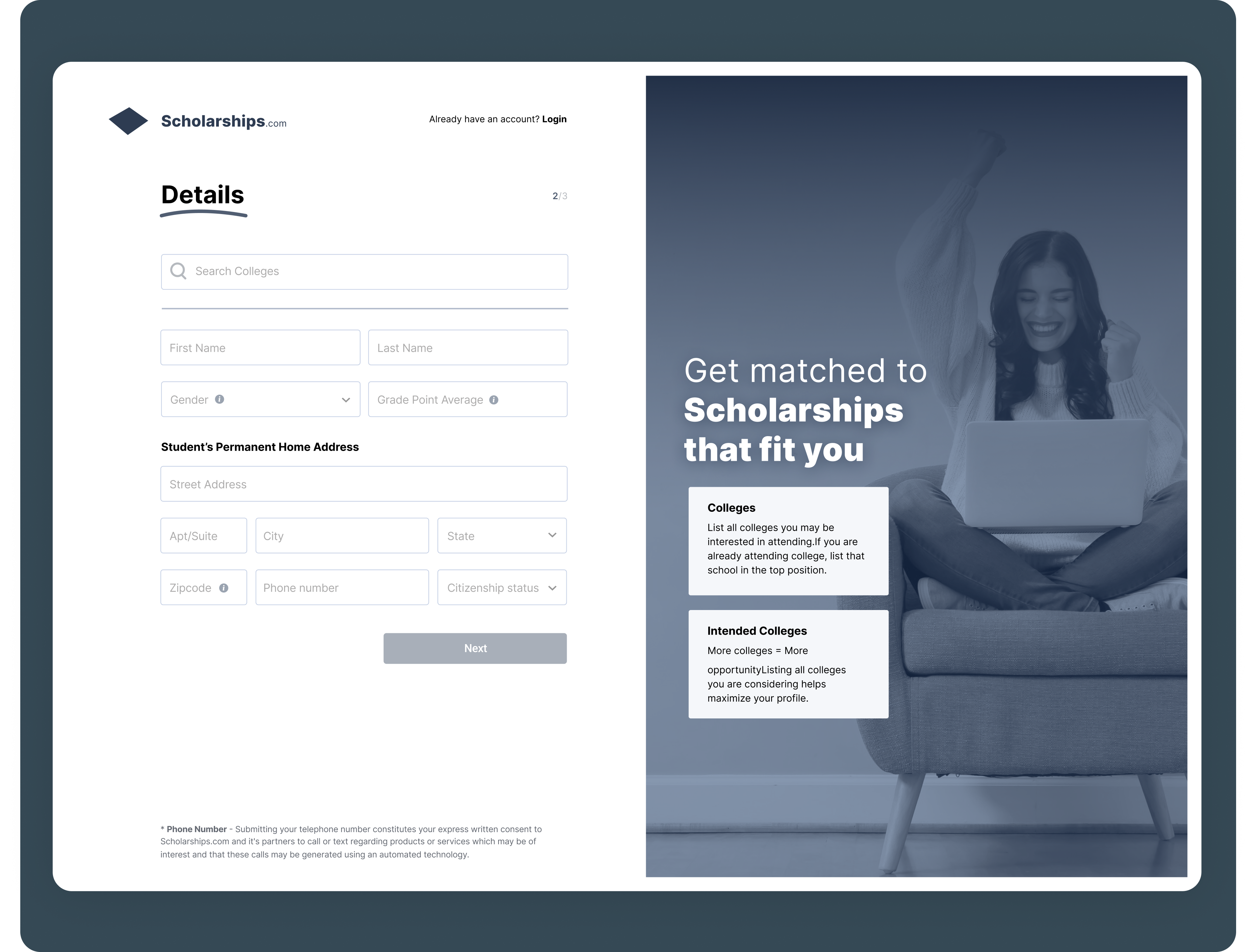
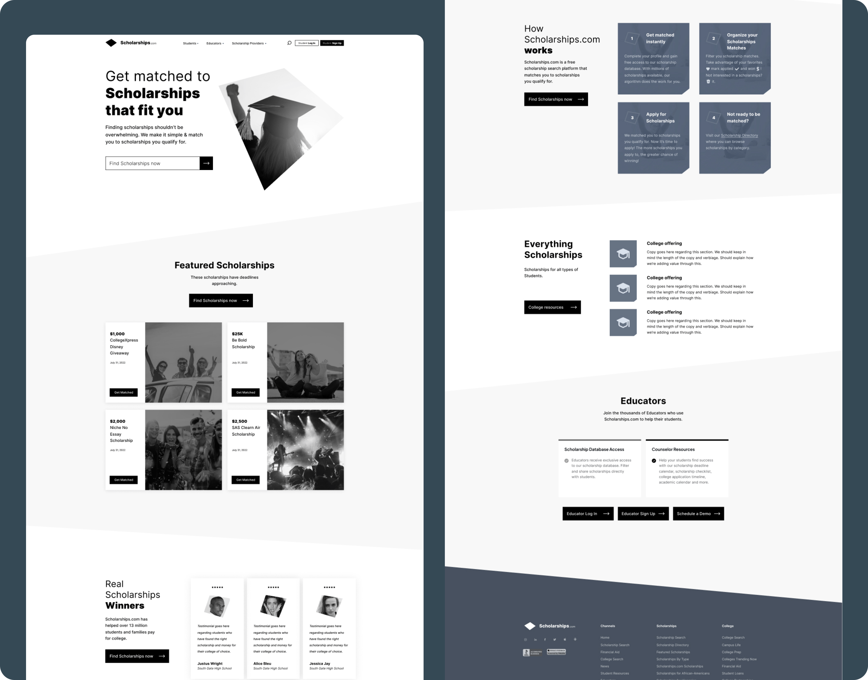
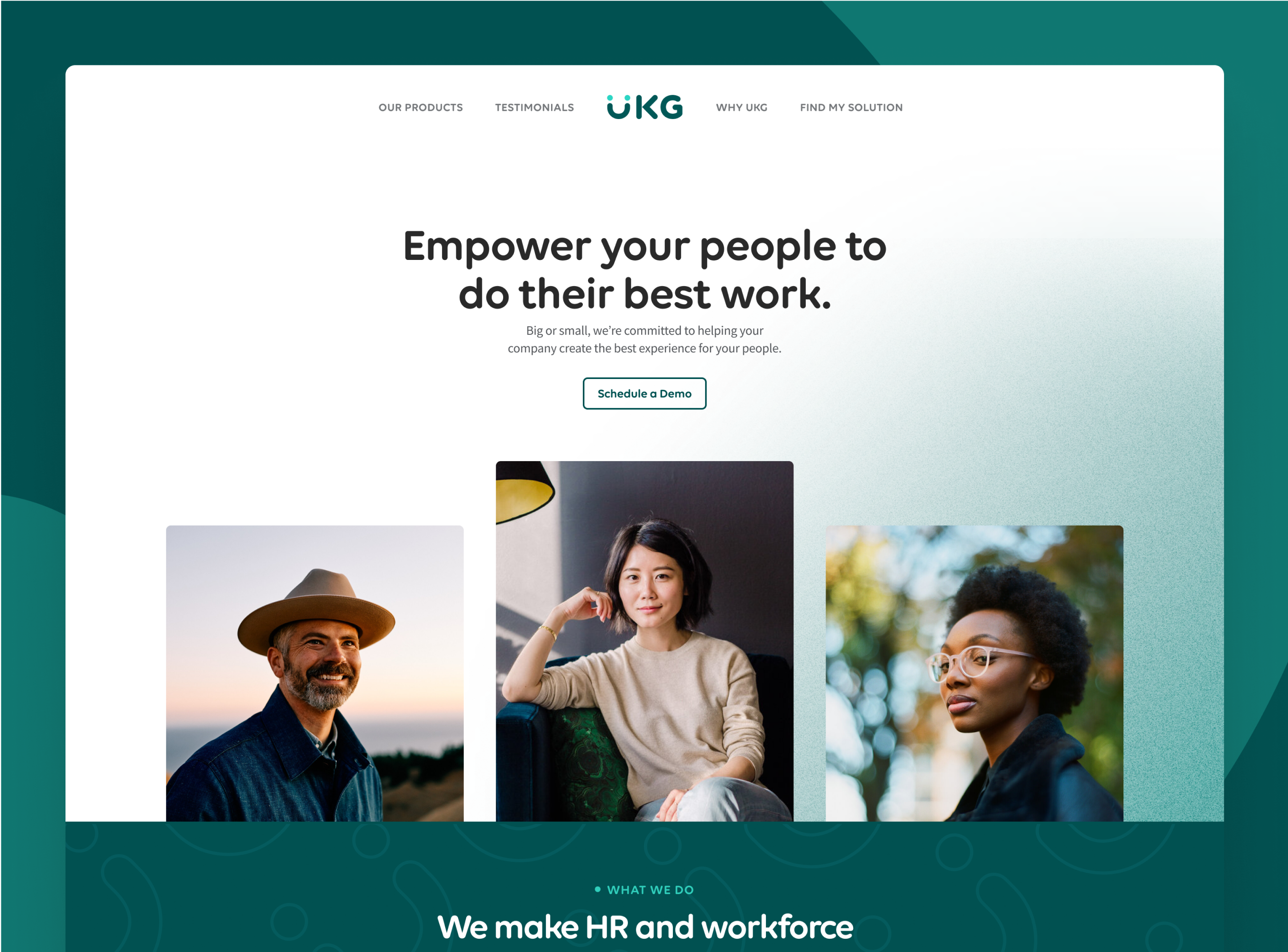
User Interface Design
User Interface (UI) Design is the art of visual storytelling between a product and its users. The journey begins with the assembly of mood boards, which act as visual anchors to establish the product’s overarching aesthetic.
This foundational step is pivotal in crafting a unified visual vocabulary that paves the way for subsequent design components.