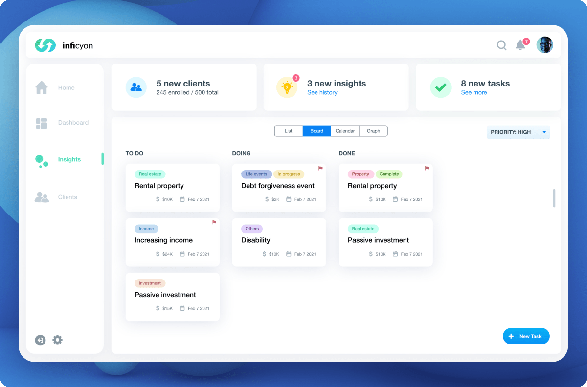
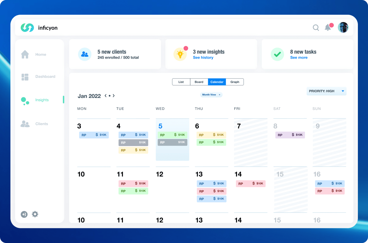
Redesigned Halcyon’s dashboard for real-time performance insights, transforming user behavior analysis and driving revenue opportunities.
Summary
In my journey with Halcyon, I’ve aimed to redefine what it means to be financially intuitive. Picture this—a seamless, real-time experience that brings financial advisors, management, and clients onto the same page. Using our groundbreaking proprietary platform, I’ve helped transform a complicated maze into a user-friendly dashboard. This isn’t just about making work easier; it’s about foreseeing opportunities for revenue generation and acting on them.
I’ve turned advisors into financial visionaries, managers into strategic maestros, and clients into informed participants. Through real-time, predictive analytics, we’re not just providing services; we’re delivering exactly what people need at life’s crucial milestones. That’s the future of financial advisement, sophisticated yet accessible.
Roles
Principal of Design
UX Designer
UI Designer
Researcher
Tools
Figma
Adobe CC
Miro
Responsibilities
Strategy
Competitive Research
Qualitative Research
User Personas
UX & Visual Design
Prototyping
Challenge
Halcyon’s existing platform was a paradox: powerful yet user-unfriendly. While the technology could offer real-time, predictive insights to financial advisors and managers, its complex interface hindered effective use. Essentially, we had robust capabilities hampered by a clunky user experience.
Solution
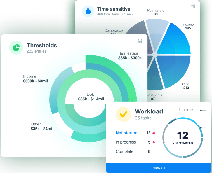
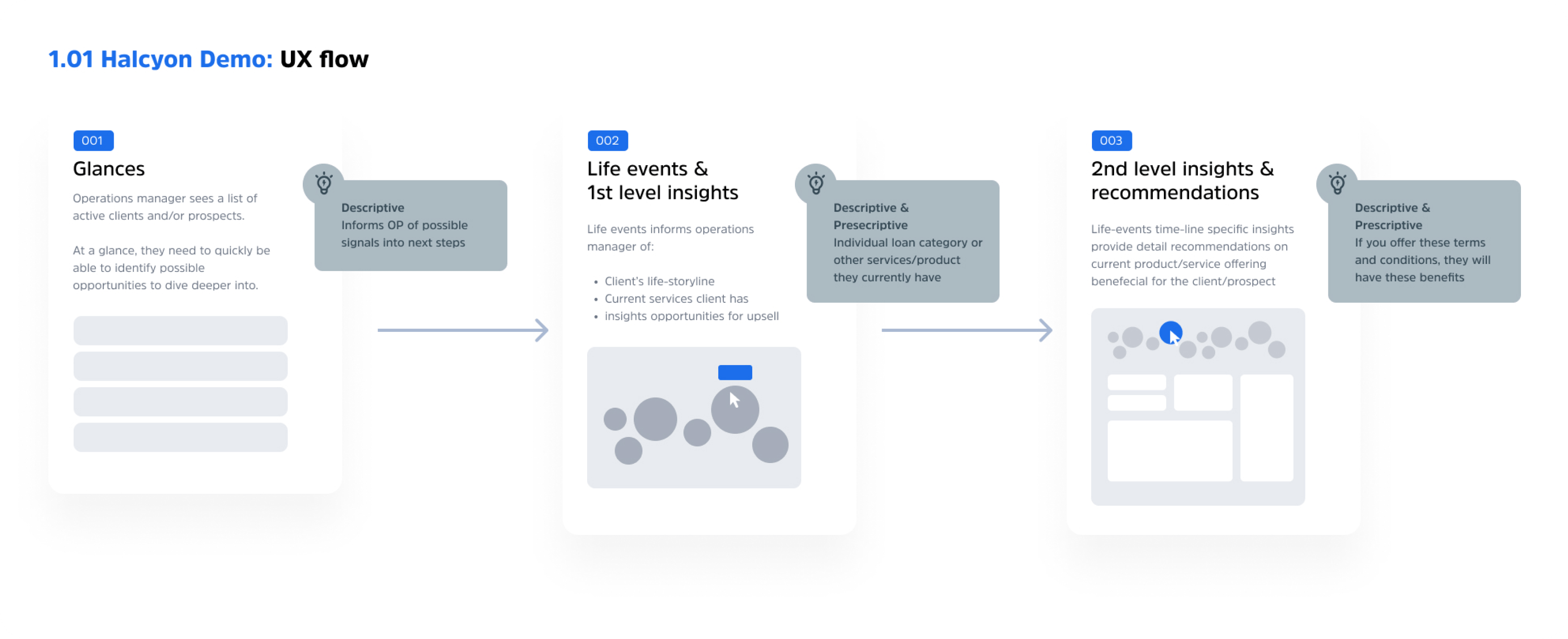
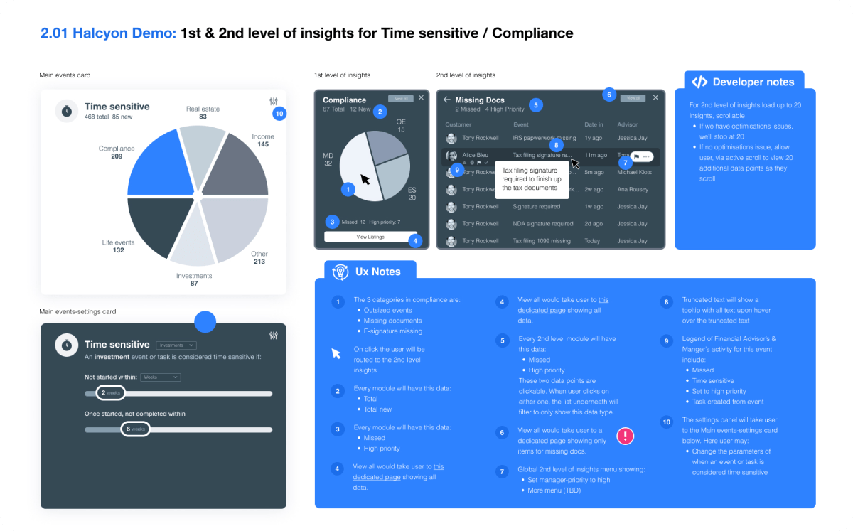
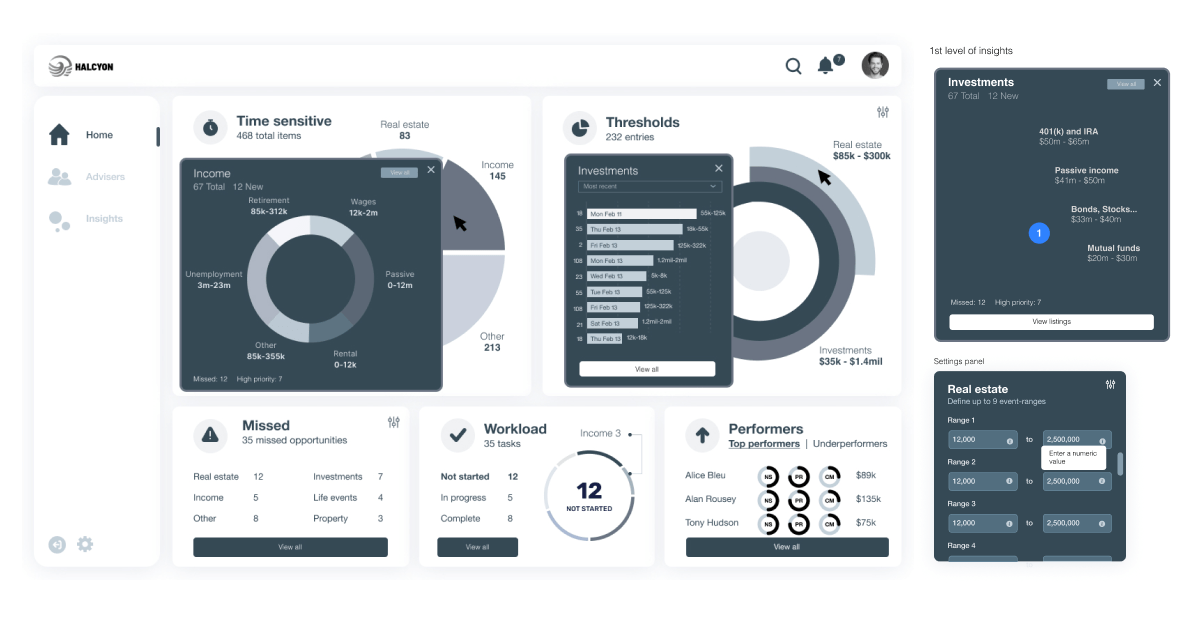
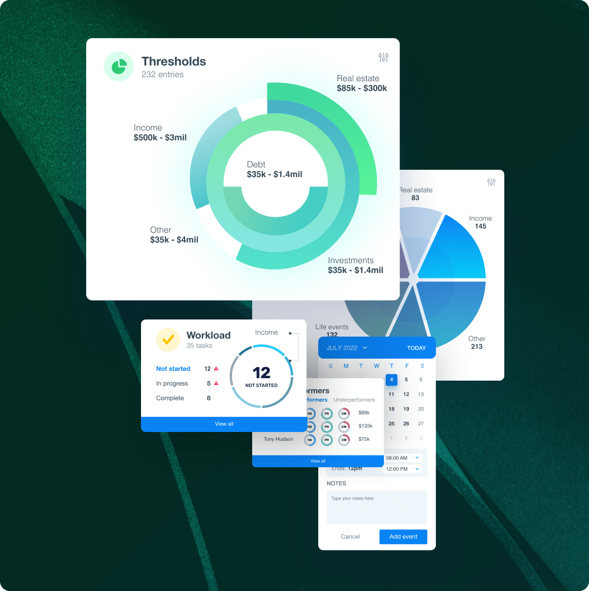
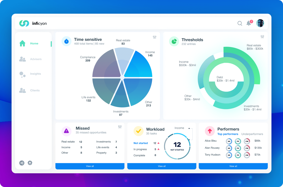
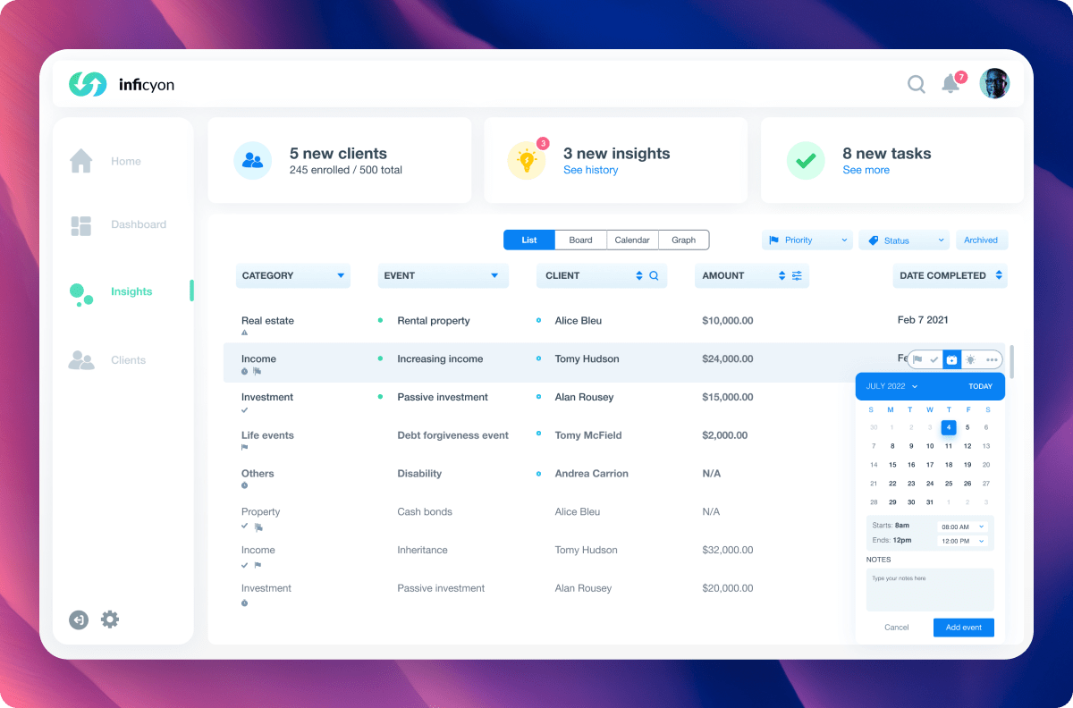
My solution was to revamp the platform into an intuitive, user-friendly dashboard. We distilled complex real-time data into easily digestible visuals, enabling managers to monitor performance and advisors to identify revenue opportunities more efficiently. It wasn’t just a makeover; it was a game-changer in usability and efficiency.
Process
Market Research: Qualitative
To grasp the current user experience across admins, managers, and financial advisors, we kicked off with targeted surveys and interviews. This initial research aimed to illuminate not just how the existing platform was being used, but also where the friction points lay for each user type.
Surveys
In line with our qualitative inquiry, we reached out to 8 admins, 6 managers, and 12 financial advisors to gauge their level of satisfaction and identify pain points within the existing system. The feedback was unanimous: profound frustration over the platform’s current inefficiencies. Specifically, managers lamented the lack of access to real-time data, while financial advisors felt hamstrung by delays in actionable insights, subsequently missing out on revenue opportunities.
Interviews
Of the 26 individuals initially surveyed, we conducted in-depth interviews with 4 admins, 4 managers, and 6 financial advisors. This allowed us to delve deeper into their platform usage and pinpoint their specific challenges more accurately.
Synthesis
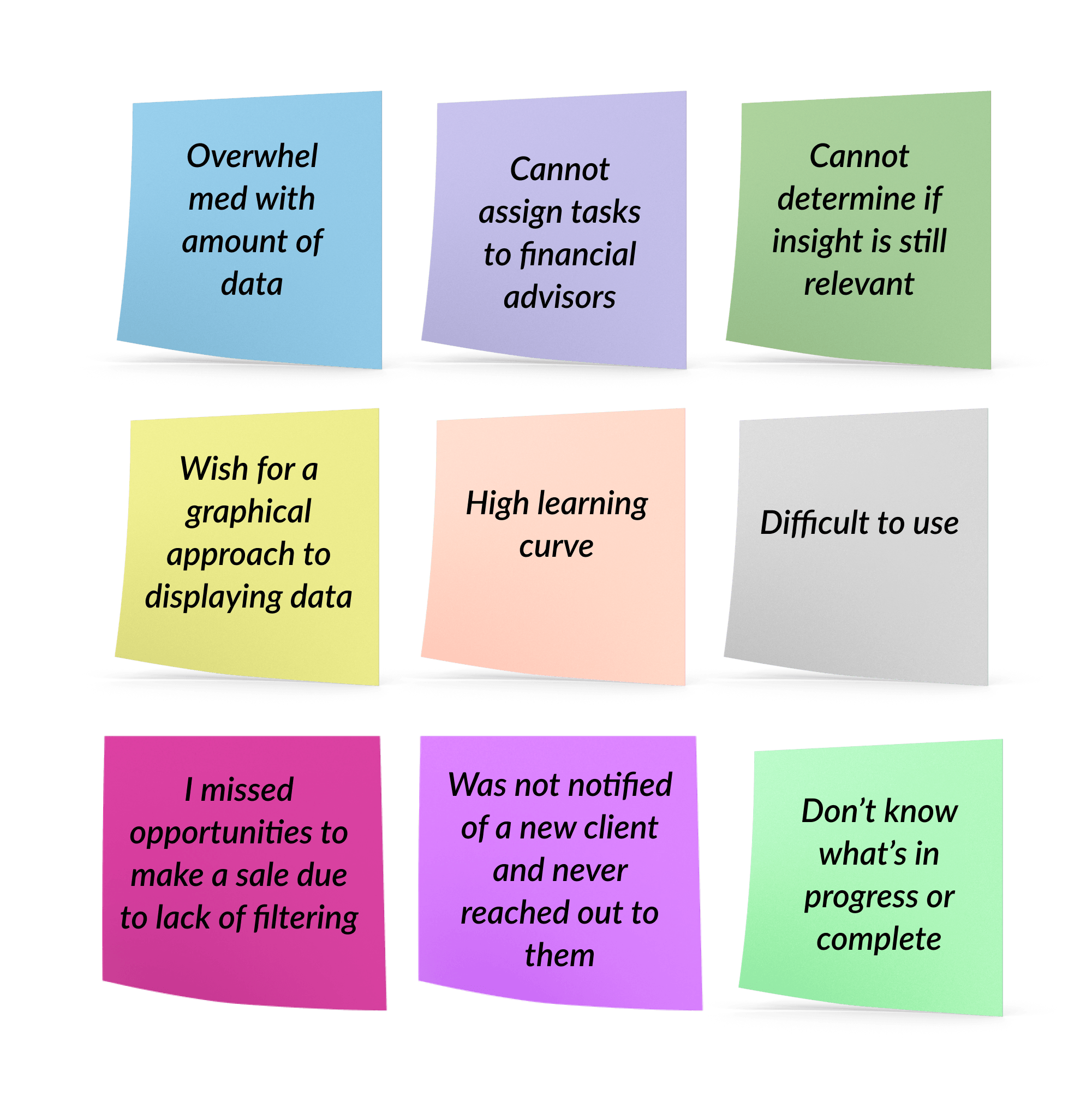
Data synthesis revealed these prevalent challenges:
Difficulty in interpreting the displayed data
Inconsistent functionality across the platform
Managers struggling to promptly address concerns with financial advisors
Financial advisors unable to effectively utilize provided insights
Inadequate search and filtering features Note: The points listed are direct feedback culled from user interviews.
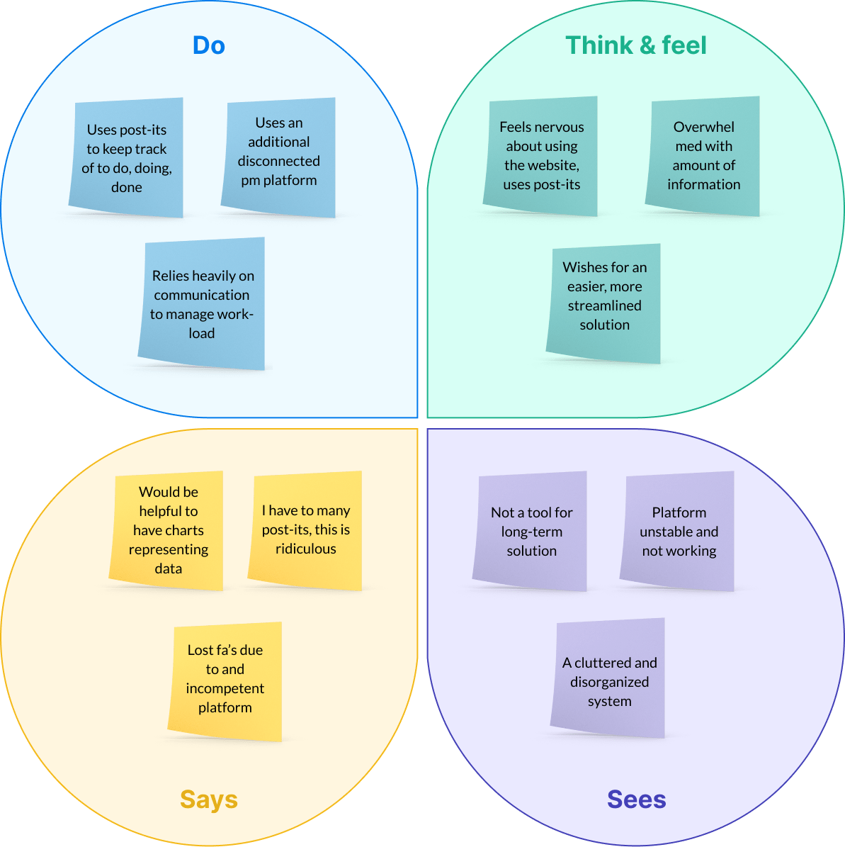
Empathy Map
We categorized users’ pain points gathered from interviews based on:
Thoughts and feelings
Visual observations
Verbal expressions
Actions taken.
This method streamlined the identification of each issue by its unique attributes.
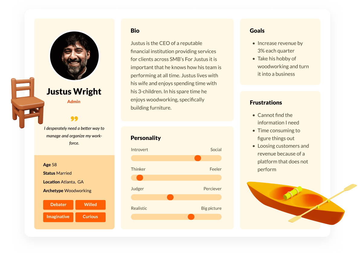
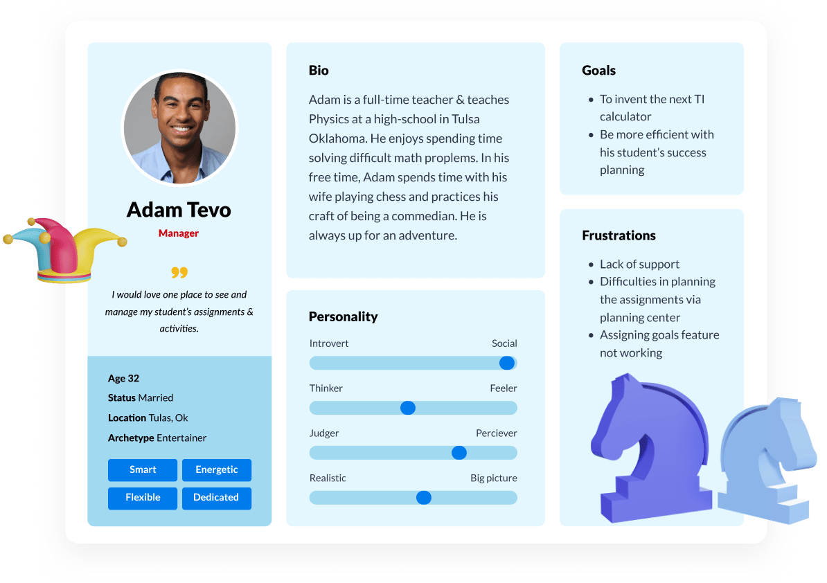
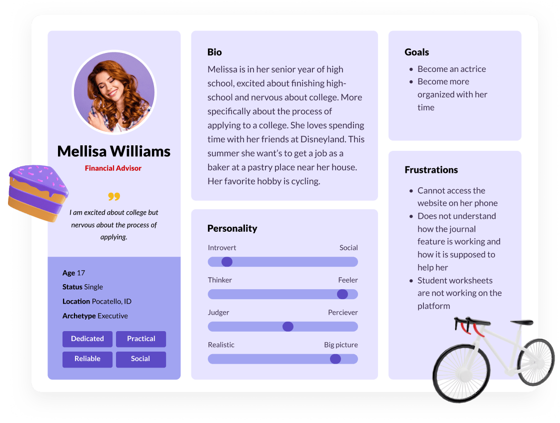
User Personas
From the interviews and user research, I developed user personas that encapsulate a range of details like age, occupation, and interests.
These personas also highlight the features and tools most sought-after by users, as well as their objectives and challenges.
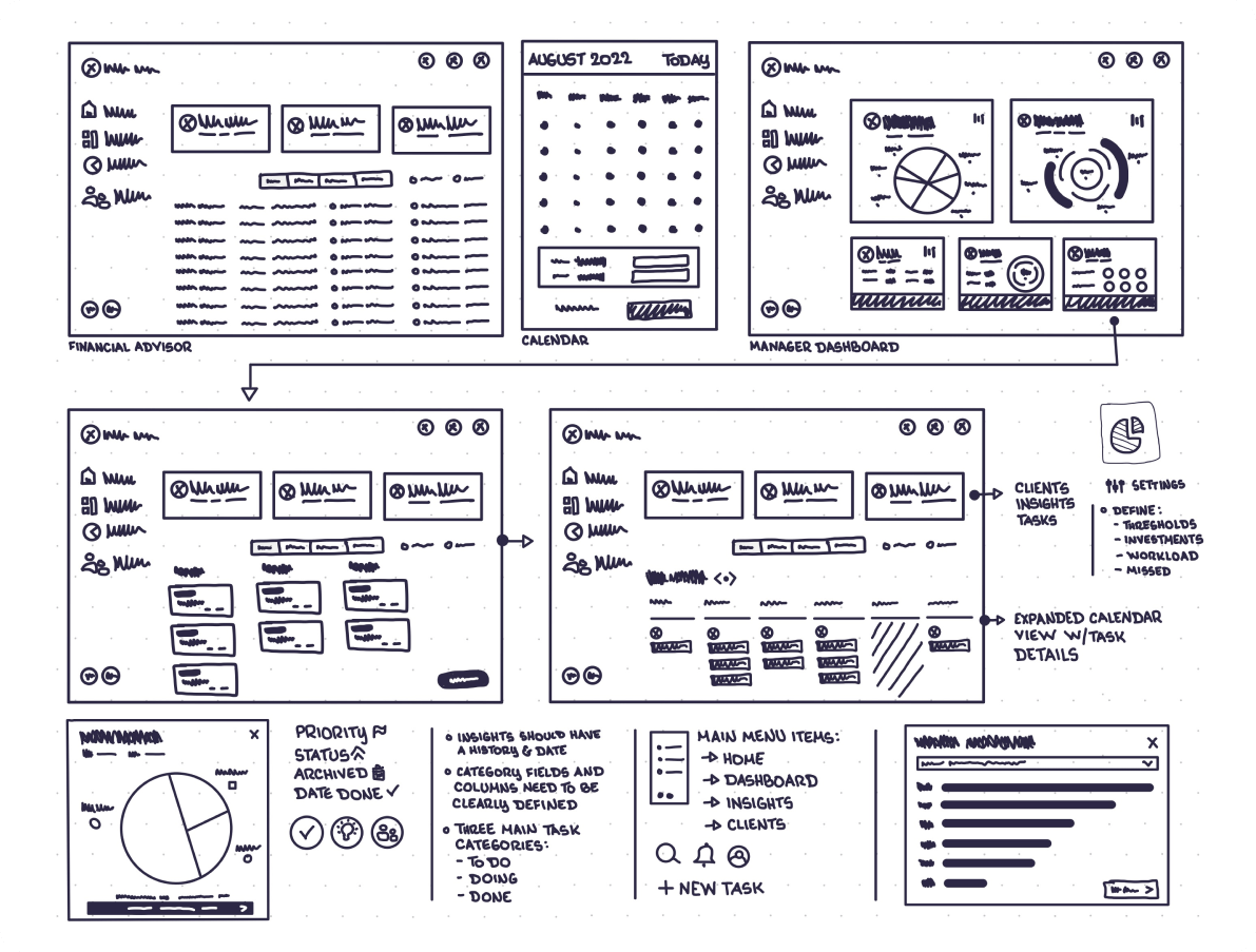
Sketching
In the initial phase of product design, low-fidelity sketches serve as a rapid ideation technique.
The primary aim here is to map out the functional logic of the product, setting aside aesthetic considerations like color, imagery, and illustrations.
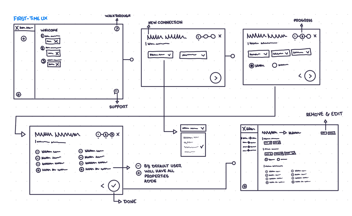
High fidelity wireframes
Following the refinement of sketches, we transition to creating annotated wireframes. These high-fidelity, black-and-white digital renderings offer greater detail.
At this stage, we focus on fine-tuning the product’s operational methodology and blueprint.
User Interface Design: Desktop
User Interface (UI) Design is the art of shaping a product’s visual language to effectively communicate with its users.